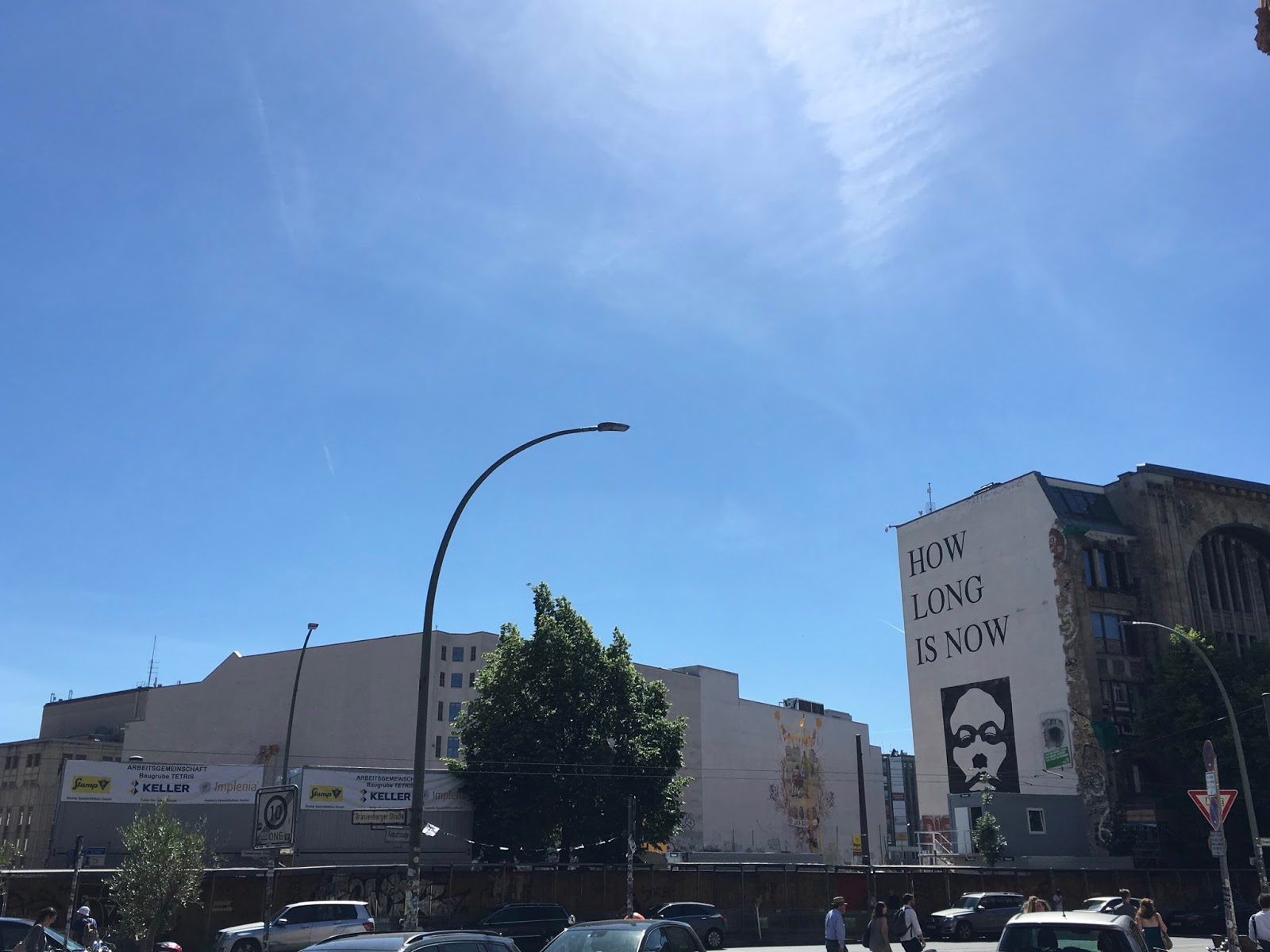
Without wanting to come across as some kind of travel blog, I'd just like to post a few quick photos from my recent inter rail trip around Europe. It was really great and refreshing to spend time in cities rich in culture and with a creative heartbeat.
Quite a shock to see how much Berlin (& its art scene) had changed since I was last there. Still had the Warhol banana graffiti signifying the location of an art gallery, which was useful as some were a little hard to spot. It was also excellent to visit the Computerspielemuseum which exhibited a few nice examples of Game Art.
Or more accurately, why do we like the Drive-By Truckers?
In the days following the US elections, I listen to the latest album by Alabama band Drive-By Truckers, entitled American Band. The album is a snapshot of the increasingly polarised US of the past year. Songs about race, riots, high school shootings and politics. It’s a call to arms that lost the band a great deal of their followers.
But this isn’t about American Band, its about how a group of seven lads on the Northern Irish border got into this band in a really, really big way.
It started in 2003 when one of my friends shoplifted Decoration Day from Virgin Megastores in Derry because he liked the cover. I guess I have Wes Freed’s incredible album artwork to thank for kickstarting me into this band. We were seven teenagers from about 14-18 and into art, literature and music. I’d say we were fairly atypical for kids that grew up in a small rural village. We sat around in the garage after band practice and listened to Decoration Day. I recall my first impressions as being a little kooky, a little heavy and a little country. The opening song, about incest in the deep south, begins a cappella until the rest of the band are introduced, building up to a glorious chord progression complete with pedal steel guitar and upright bass. The closest band I could think of at the time was the Eels.
Decoration Day went back in the CD collection and somewhere along the line someone got Souther Rock Opera and The Dirty South. It was at this time I got into the band in a serious way.
Decoration Day’s title track is a tale of deep-seated petty intergenerational family rivalry certainly strikes a chord. The narrator (Jason Isbell) has a decidedly removed delivery from the deeds and motives of his hated and ultimately understood father. Without trying to go too deep there are themes that resonate with the political system and religious rivalries Northern Ireland is infamous for. Of course, I didn’t realise this at the time.
Isbell doesn’t even divulge what motivated his father and instigated the historic rivalry, but focuses more on the short vignetted brutality and emotional dissonance caused. To us, the Catholic/Protestant divide was certainly visible but it didn’t matter as we were a mixed group of friends. I identified with the singer’s take on the story and his vitriol to the historic feuding in the song.
I’ve always said that the DBTs write songs that have dumb music and clever lyrics, and I don’t mean this in a bad way. In 2003 I was in a garage band trying to play songs by Neil Young, The Who, Black Sabbath and Led Zeppelin. We chugged along trying to land the musical acrobatics before dawning on the realisation that we could just chug along ourselves and it sounded pretty good. It was at this time I really got into primal fuzzy garage riffing typified by Ronnie and Neil from Souther Rock Opera. Again, a simple Sabbath/Young esque chordal descent creates the luscious audio carpet for a tale of southern racism via music, name dropping Wilson Pickett and Aretha Franklin, culminating in a battle cry tale of Ronnie Van Zant and Neil Young, complete with three guitar harmony. Wow!
Putting People on the Moon, from The Dirty South, could have been written about any town that experienced hardship. Our own village was famous in the Irish linen days, and many of our families worked in the local mill. The mill was shut down about the time of that album due to production going to Africa (and leading to the company folding). The feeling of angry acceptance captured in this song could be felt throughout the village for years.
It’s difficult to say why a random and still largely unknown oddball American band became the favourite band of a small group of teenagers from the rural Northern Ireland border. To this day, I’ve bought every album, spin off and DVD, and we’re all going to see them again in February.
Recently one of my friends said he was glad that, out of all the music we listened to as teenagers, this was the band that stuck. I’ve got to agree.
I've occasionally dabbled in game development, having a handful of projects, some completed and some not so completed. I really enjoy the process of making, coding, artwork and music.
Although this is not a development blog, I'd like to include a few details of a game and talk through my choices. The game is a modern take on 90's computer platformers, with inspiration from shareware titles and characters of the era. Computer platform games often lacked the sheen of their console counterparts, but they had an endearing clunkiness and idiosyncratic charm of their own. This has generally been overlooked, with modern indie games typically paying homage to more popular NES, SNES and Sega titles.
Although this will probably a widely unpopular decision, I've tried to capture the stiffness and primitiveness of the system in my game. Being bluntly honest, the 'retro' style for indie games has been done to death. I couldn't see myself making this game with any other way, as the graphic style and control style were essential to the core themes of the game.
Without going into too much detail (for now) the game was inspired by Duke Nukem Forever and the movie 'The Wrestler'.
I enjoyed Duke Nukem Forever (played it to the end) but it wasn't the Duke game that I wanted.
I wanted to explore the idea of a 1990 video game mascot, trying to make it in a 2016 game. The main character is old and withered beyond his days. No longer the macho man world-saver, years of hard living, steroids and substances have taken their toll. There hasn't been an alien invasion in 15 years and he is trying to find his place in a society where his heroics are largely forgotten. There are parallels here to The Wrestler but also generally film, sport and music personalities. It's a little bit about celebrity culture with a knowing wink.
I'd like to share some graphics from the game: two things I worked on yesterday. One is the scores: when you collect an item you get either 100, 500 and 1000 points.
The scores get incrementally taller. The other is a gun pickup, which gives you 10 ammo.
I settled on the blue gun, rather than have it realistic and grey. Also, there is a lot of grey in the background tiles and I'd like the item to stand out as such. The blue is a colour associated with the main character too. I wanted to have shooting (aliens) in the game to be something of a secondary task, with actual platforming and puzzle solving the main thing. There will be some ammo throughout but not much, and as the main character is now old, his aim will be somewhat wonky. Designing a gun for a game also reminded me of the recent issues with the gun emoji (pistol, raygun, water pistol, etc, depending on your OS) with some being interpreted differently and the backlash from gun people.
Here is my colour palette, taken straight from Deluxe Paint (my tool of choice as a youth). I mentioned briefly before about my hate for pixel games. Most of this comes from pixel art that is not true to source. Scaling pixels, too many frames of animation, colours, shaders, screen size, etc. I wanted to get this right, even down to the basic 32 colours. Also, it's great to be limited some times, it can be both a motivator and inspiration.
I've updated my website & axis with details from my latest project, Postcards from Ankara. It's been really great to work with digital/ceramicist Sarah Younan again.
The exhibition entitled A Space to call my Own is in CerModern in Ankara, Turkey, and opens on the 14th of April 2016.